
Hi! I'm Ava Mandoli.
I'm a data journalist, web developer and designer currently interning on the graphics team at The Seattle Times.I recently graduated from Northwestern University, where I studied journalism, global history and data science.Being able to code, design, and write lets me create work that’s both deeply reported and visually engaging. Human-centered, data-driven stories are my favorite to both read and create. At The Seattle Times, I develop interactives across desks—from features and metro to sports—create daily graphics for print and digital platforms, and conduct data-driven reporting on environmental issues.Previously, I've done design and development work at the San Francisco Chronicle, written about entrepreneurship for Inc. Magazine, reported on agribusiness for Investigate Midwest and consulted for Chicago-area news outlets at Medill's Local News Accelerator.
At Northwestern, I co-founded the Data Journalism Collective and established a new data visualization desk at The Daily Northwestern.Born and raised in St. Louis, Missouri, I'm a proud Midwesterner and care deeply about the health of our local news ecosystems.Things that bring me joy outside of work include fiber arts, reading, exploring new neighborhoods and biking.You can contact me at [email protected].
Data journalism, design and development projects:
Ichiro in Hall of Fame: Interactive look at Mariners icon’s hit total – The Seattle Times
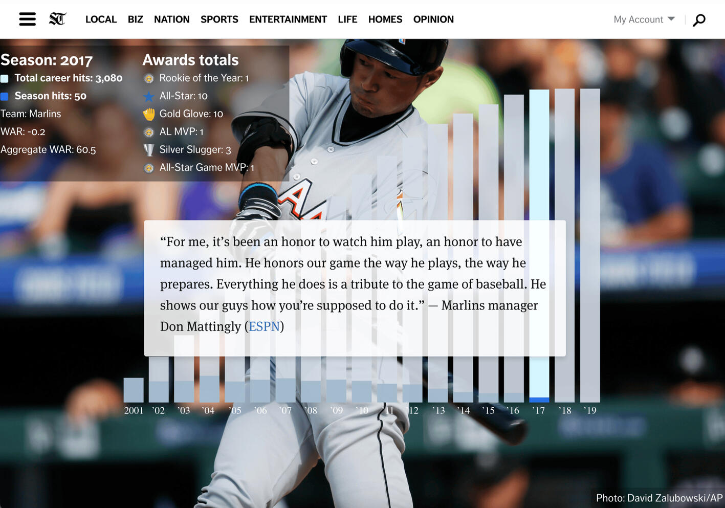
I developed this interactive story to illustrate the career highlights of Seattle baseball legend Ichiro Suzuki, using HTML/CSS and JavaScript. As the reader scrolls, each year of the graph becomes highlighted, the stats box updates, and the text blocks provide context about that year.
I collaborated with sports reporters to include this in a broader package on Suzuki being inducted into the MLB Hall of Fame, where he became the first Asian player to be inducted.
You can view a short screen recording of the interactive here.
Walk Seattle’s waterfront with this map to its newest features– The Seattle Times
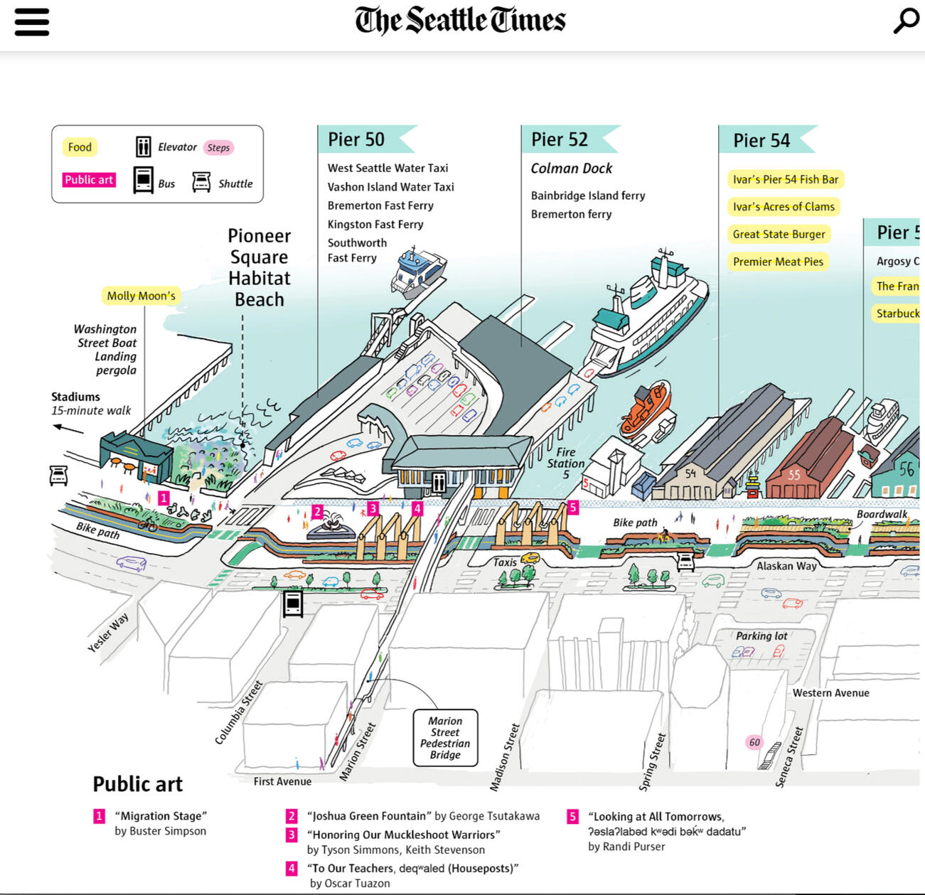
I worked with news artist Gabriel Campanario to design a better way to display a long horizontal graphic on the web. The resulting horizontal scroller allows readers on both desktop and mobile to engage more fully by revealing the graphic gradually as they scroll.
You can view a screen recording of the scroller here.
Rubik's Cube Competition Typing Game – The Seattle Times
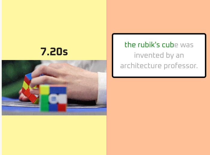
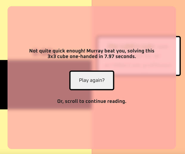
For this colorful feature on the Rubik’s World Cube Association World Championship in Seattle, I developed a minigame to illustrate to readers just how quick the competitors are.
Readers are challenged to to see if they can type a fun fact about Rubik's cubing faster than a competitor can solve a 3x3 cube blindfolded. It's harder than you might think!
You can view a screen recording of the interactive here.
Zoom scrollyteller template – San Francisco Chronicle
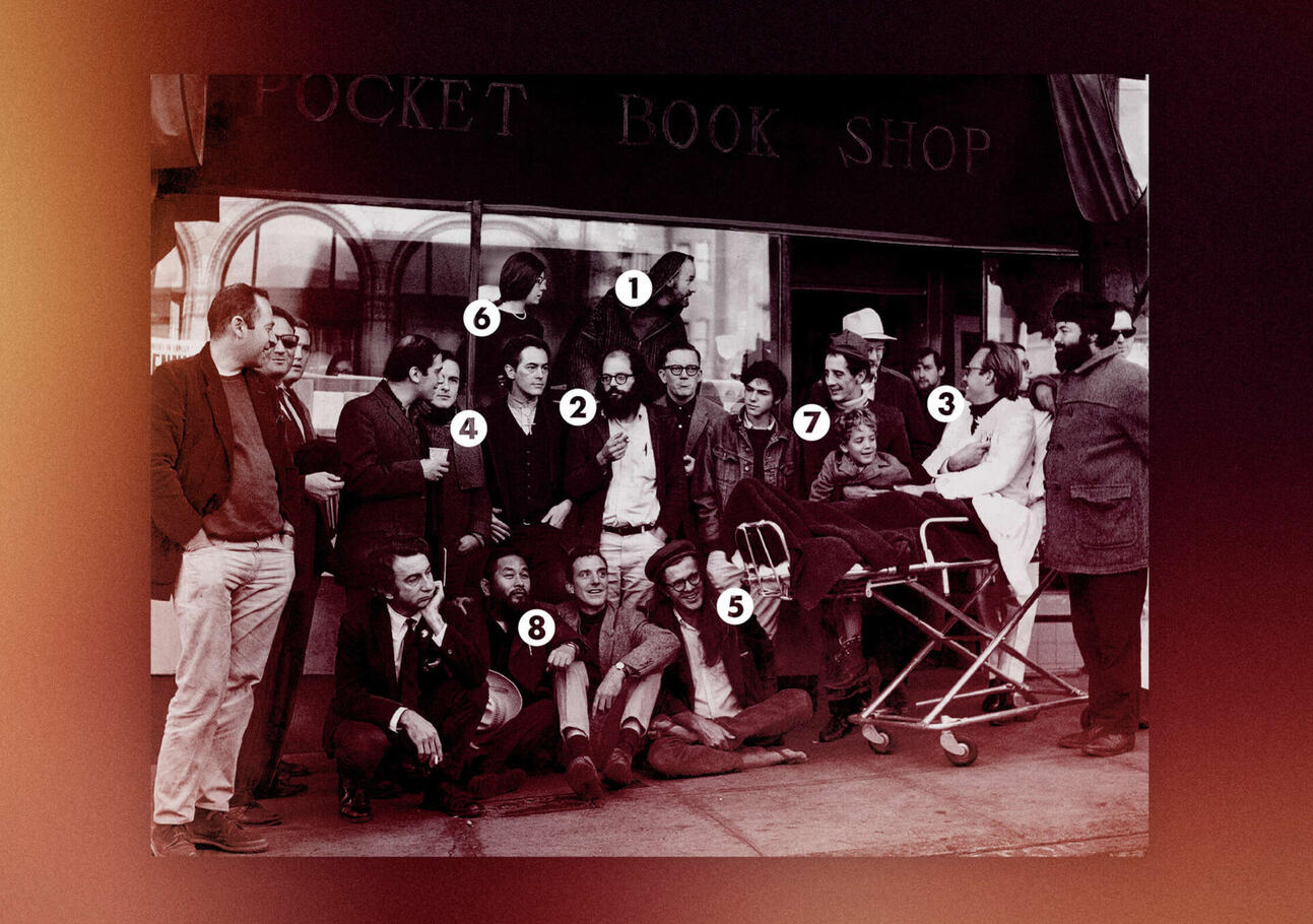
At the SF Chronicle, I coded a non-developer-friendly “click to publish” template for storytelling with a single detail-rich image. As one scrolls down, it zooms into different designated parts of the image where the reporter can explain the significance of the featured subject.
Two examples of the template in use include this story about a group photo of famous Beat poets, and this story about the 1906 earthquake's effect on downtown San Francisco.
ArchieML Tag Generator – San Francisco Chronicle
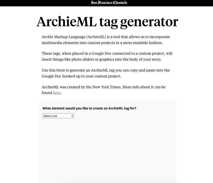
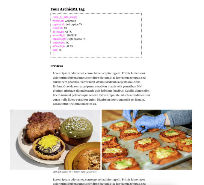
Previously, creating a photo story layout outside the Chronicle’s CMS required photo team members to send screenshots and metadata to the design team, who then manually wrote ArchieML tags in a Google Doc.
To reduce this friction, I created an internal tag generator that automatically provided a form with the different fields required for each visual component (inline image, gallery, image slider, video, etc.)
The form returned inputs as a copiable tag with correct formatting (font colors, weights and spacing) that users could easily copy and paste into a Google Doc.
It also provided a sample page preview (above right) with the selected visual component and filler text.
More than 75% of egg-laying hens live in states with little-to-no welfare protections – Investigate Midwest
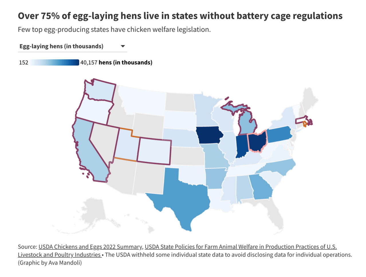
Farmed animal welfare legislation has long been lacking in the U.S. I combined two datasets – one on the number of egg-laying hens per state and another on what each state's battery cage regulations are – to develop this map in Flourish. The results highlighted the states where increased battery cage legislation would make a big difference.
This was a quick turnaround data viz and explainer for Investigate Midwest's "Graphic of the Week."
Reporting:
Tim Tkachenko Has 60-Plus Co-Founders. Why He Wouldn't Have It Any Other Way – Inc. Magazine
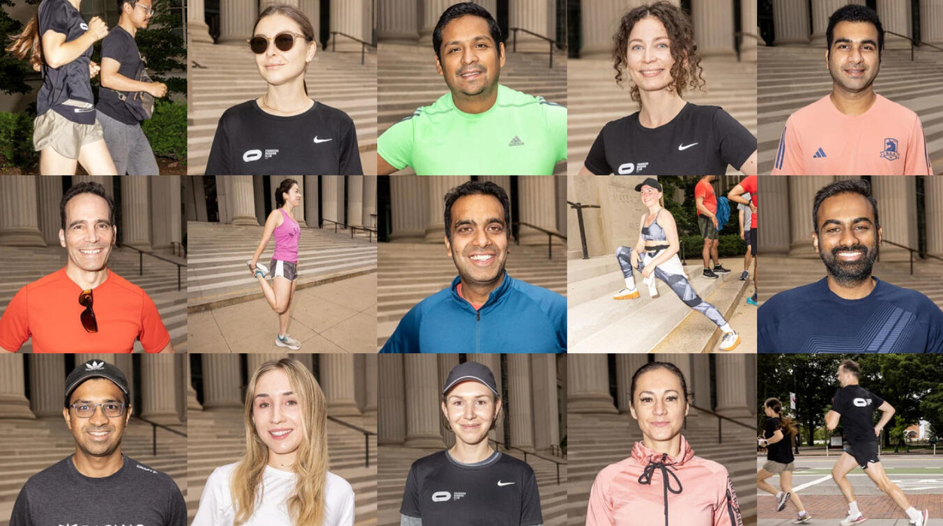
For Inc. Magazine, I wrote this feature tracing the breakneck expansion of this running club for entrepreneurs across the world. The piece landed in Inc.'s Premium section, the magazine's prime location for inspiring and intriguing people-driven narratives.
Here's a PDF version of the story if you can't access it.
Employees Want Better--and Wider Ranging--Caregiver Policies – Inc. Magazine

At Inc., I wrote an average of three quick hits per week in addition to pursuing enterprise stories. My beat encompassed everything from the future of workplaces, to employee satisfaction, to the rapidly changing labor market.
In quick hits, I frequently included data visualizations to illustrate key points, as I did in this story about the caregiving responsibilities many employees have.
Iowa skipper butterfly 'canary in coal mine': A warning sign of prairie loss consequences for farmers, wildlife alike – Investigate Midwest

I interviewed over a dozen conservation experts, farmers and government employees to write this story about the intertwined plight of the Iowa skipper butterfly and our country's agricultural system.
To show the scope of prairie degradation in the Midwest, I analyzed data from the USDA and EPA and created an interactive map in Flourish.
I also took photos of Fults Hill Prairie (pictured above) to illustrate the rich biodiversity of this overlooked ecosystem.
A Coalition’s Composition: Examining the "PI" in AAPI – nuAZN
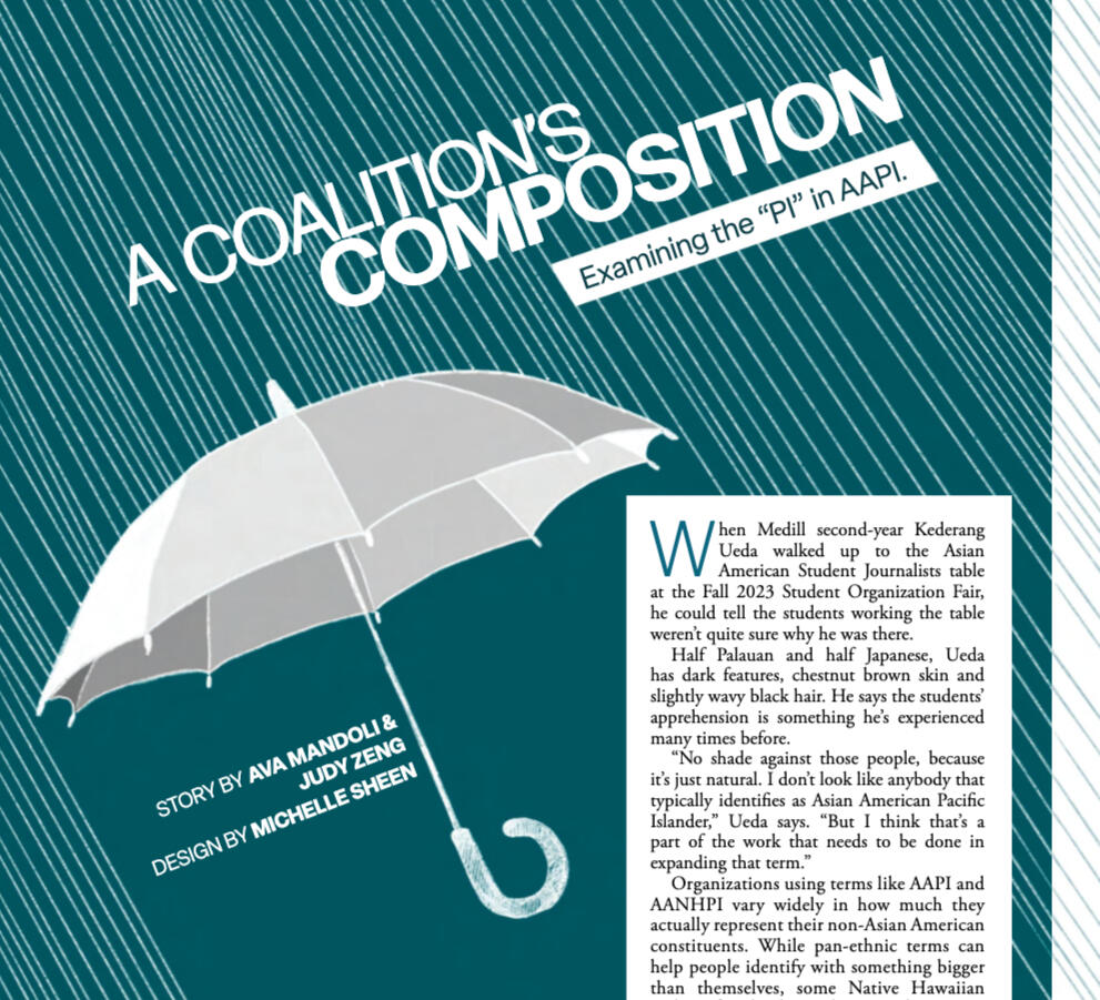
I co-wrote this story for Northwestern's Asian American-interest magazine, nuAZN, to draw attention to the importance of using umbrella terms thoughtfully and meaningfully.
My portfolio also includes photography, video, audio and other multimedia-forward work:
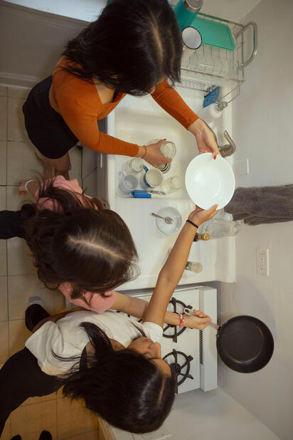
Dancing between dishes – photo essay for nuAZN
A day in the life at Northwestern vs. the University of Chicago – video for The Daily Northwestern
Sonifying Statistics: Reckoning with America’s History of Anti-Black Violence Through Sound – podcast for WNUR News
Starting The Daily Northwestern's Data Vis Desk
In Winter 2023, I took on the challenge of starting a data visualization desk at The Daily Northwestern, my school's 140+ year-old student newspaper. My experience with data journalism at that point was limited to a single introductory statistics course, but I jumped at the opportunity to integrate the sort of coverage I admired in other publications into our own.I spent that quarter constantly communicating with the city and campus desk editors and brainstorming data-driven angles for their coverage areas. I reached out to every writer that signed up for a story on the budget and offered suggestions for data visualizations to include. And I recruited everyone I knew with a vauge interest in data science or graphics to pitch original content for our desk.My priority was making data journalism as accessible as possible to anyone who was interested, so I trained desk members in no-code platforms like Flourish, Datawrapper, ArcGIS and Knight Lab tools. And I developed a data visualization style guide to ensure stylistic consistency throughout our coverage.It was this quarter that made me realize how passionate I am about data journalism. Special thanks to assistant desk editor Zoey Soh and the rest of the Daily's staff for their help in creating this legacy for the paper.
Here are a few stories I'm proudest of making and/or guiding as an editor:
This story about Evanston Township High School's disproportionate suspension rates of Black students
This story visualizing three trends that defined a historic season of NU Men's Basketball
This silly piece about the mysterious disappearance of school building letters
This visual explainer about where 988 calls go